Re-branding El Salvador and this blog
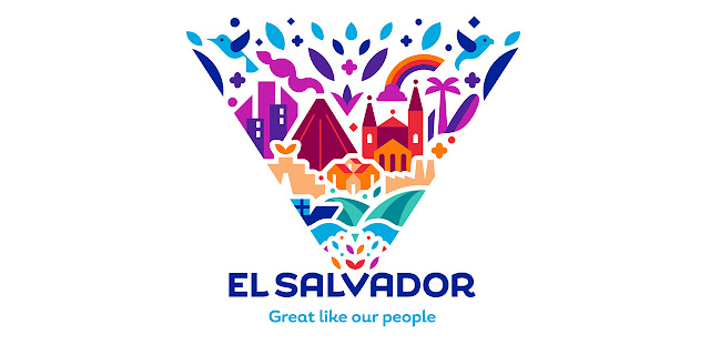
El Salvador has developed a new logo to brand itself when it goes out to seek foreign tourists and investors. The new logo was designed by the consulting firm Interbrand who explains the concept:
The new brand strategy is based on a previous study conducted by the El Salvador Government and further research carried out by Interbrand. It looks to “put El Salvador on the map as one of the new destinations and growing global economies,” says Interbrand.
A new visual identity also aims to increase international awareness of El Salvador and promote investment, exports and tourism in the country.
The logo centres on the letter “V” within El Salvador’s name and sees a “kaleidoscope” of colourful graphic icons related to the country – including a volcano, birds and waves – bursting out of it.
The logo also includes a tagline beneath the country’s name that reads: “Great like our people”.
Indigo blue has been chosen as the main colour throughout the identity due to its historic association with El Salvador. The colour is also seen in the country’s national flag, and nods to the Pacific Ocean that surrounds the country and the “gold blue” plant and dye which is one of its most important resources and exports.
El Salvador is not the only one re-branding. After 13 years, I have decided to rename this blog and update the blog design. The new name of the blog is "El Salvador Perspectives" and you should bookmark the new location: www.elsalvadorperspectives,com. All of the old content is still there from 13 years of blogging, but with a refreshed design . Take a look and let me know how what you think of the new design in the comments.

Comments